
AARRR Audits: 6 Growth Experiments To Grow This Cold Email Software
6 growth experiment ideas for MailRush, a B2B cold email automation tool.

Welcome to AARRR Audits
If you don’t already know, AARRR, which stands for acquisition, activation, retention, revenue and referral, is a growth framework popularised by Dave McClure. It is especially popular among big tech companies (like Skyscanner, where I used to work).
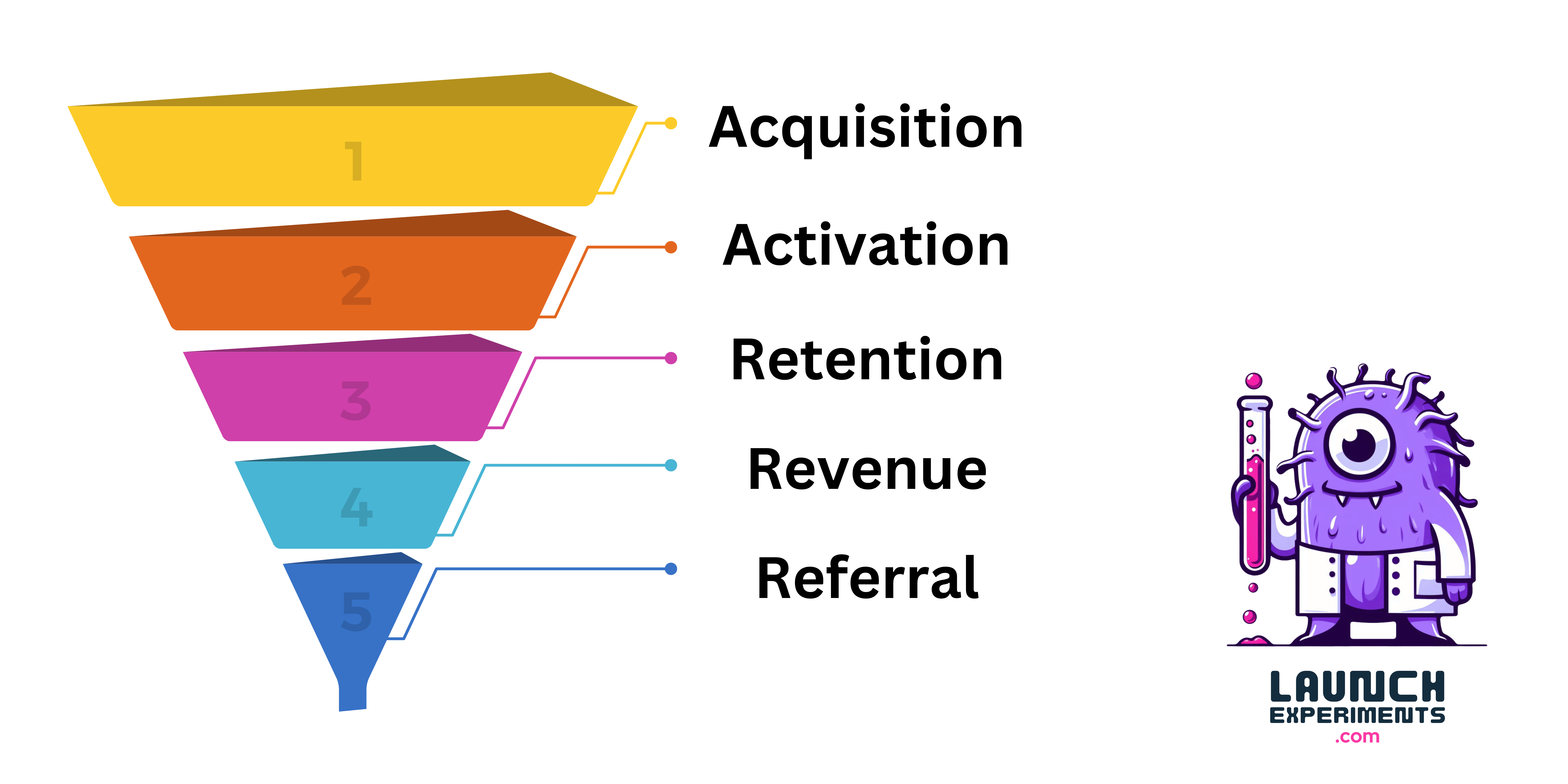
This week, we take a look at how cold email tool MailRush can boost its growth by focusing on customer acquisition, activation and retention.
💡Experiment 1: Acquisition
Launch Retargeting Campaigns
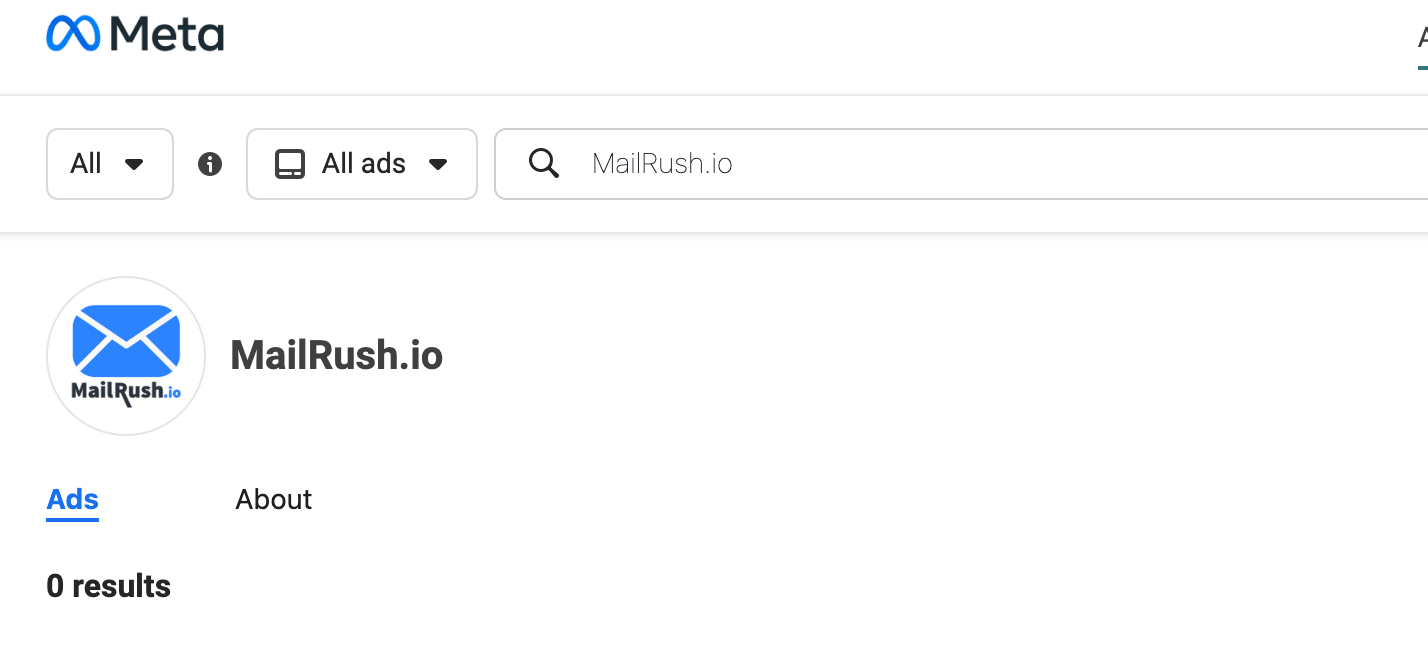
While MailRush has the Meta (Facebook) pixel installed, a quick search on Facebook Ad Library doesn’t show any active ads. You’ll get the same results on LinkedIn.
Remarketing is going to be a common theme during these audits, but it just works, and is a no-brainer. It should always be part of a traffic-generating startup’s first forays into paid marketing.
You’ve probably been retargeted before: You view an item on a site, leave, open Facebook, and find the product you were looking at being advertised to you.
Retargeting allows you to show ads to people who’ve previously visited your site, across the web and on platforms like Facebook, LinkedIn, X, and others.
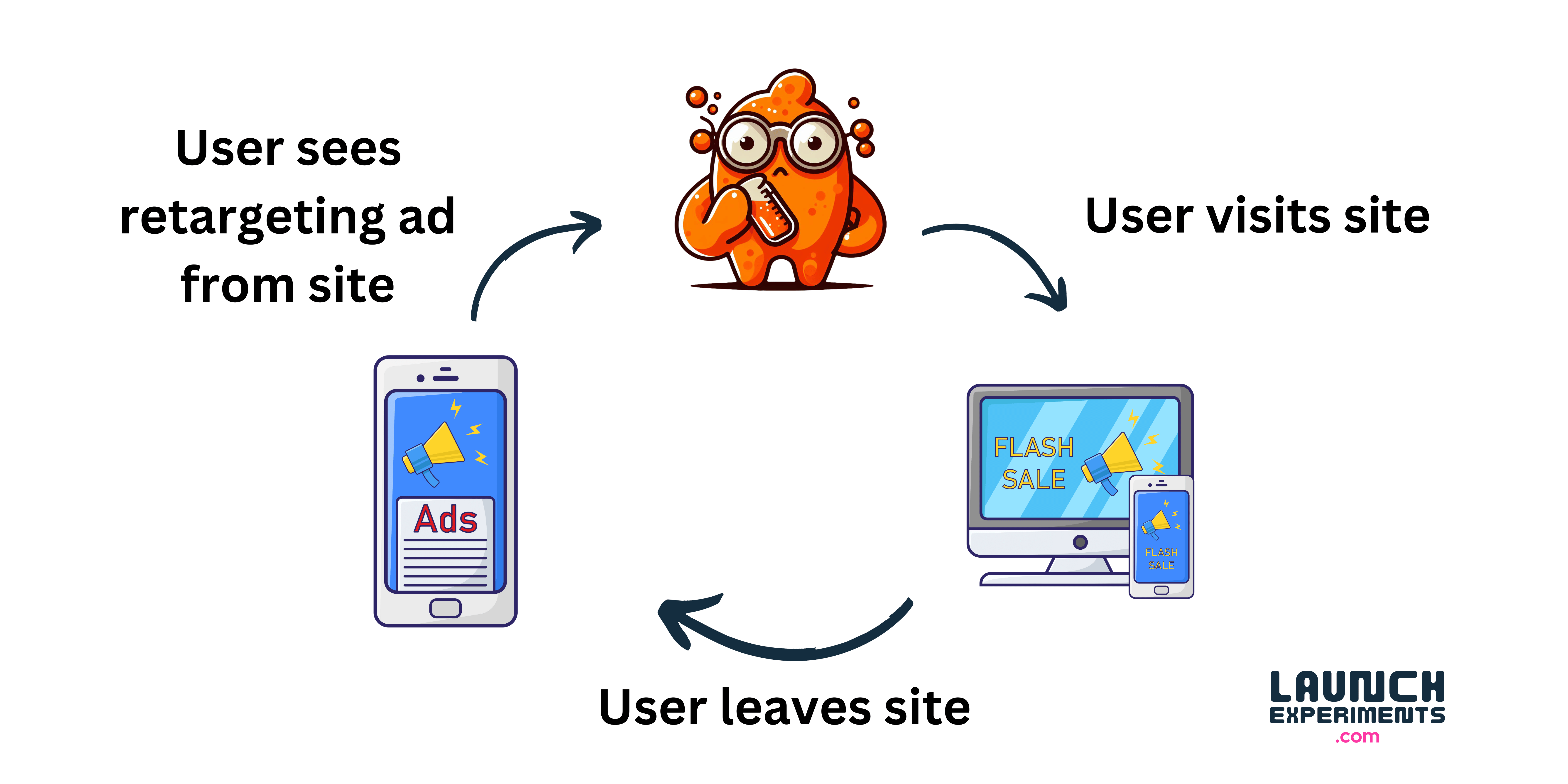
70% of users are more likely to convert when retargeted, so it’s definitely a channel you shouldn’t ignore.
💡Experiment 2: Acquisition/ Activation
Offer free email warmup as a lead magnet
I’m a user of one of MailRush’s competitors Instantly.ai after I discovered them on Google looking for a free email warmup tool.
This got me into their app where I can get exposed to their various upsells as well as their database where I can easily be sent targeted email campaigns to convert me into a paying user.
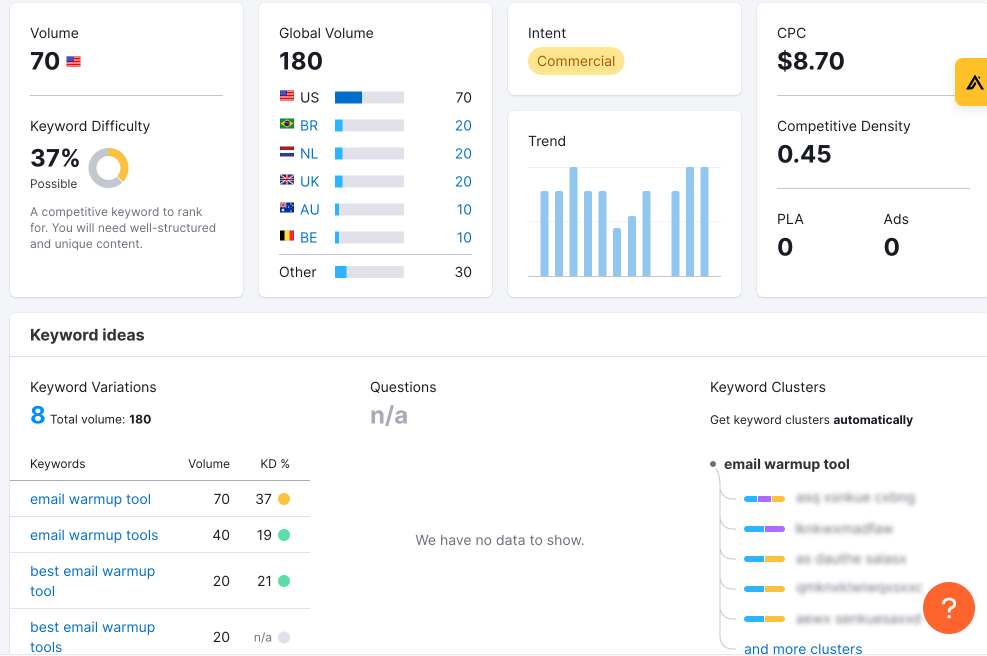
While a quick check on search volumes on SEMrush for "email warmup tools” shows roughly only a few hundred searches monthly, the keyword difficulty is relatively low. This is exactly the type of high intent long tail keyword that any business should try to rank for.
Offering free tools as a lead magnet is also a common tactic that the best in biz do. Check out Hubspot’s Website Grader and AHREF’s website traffic checker.
If MailRush can launch a landing page specifically for the warmup feature and try to get this to rank, this could be an easy way to add more sign ups to their app.
Experiment 3: Revenue
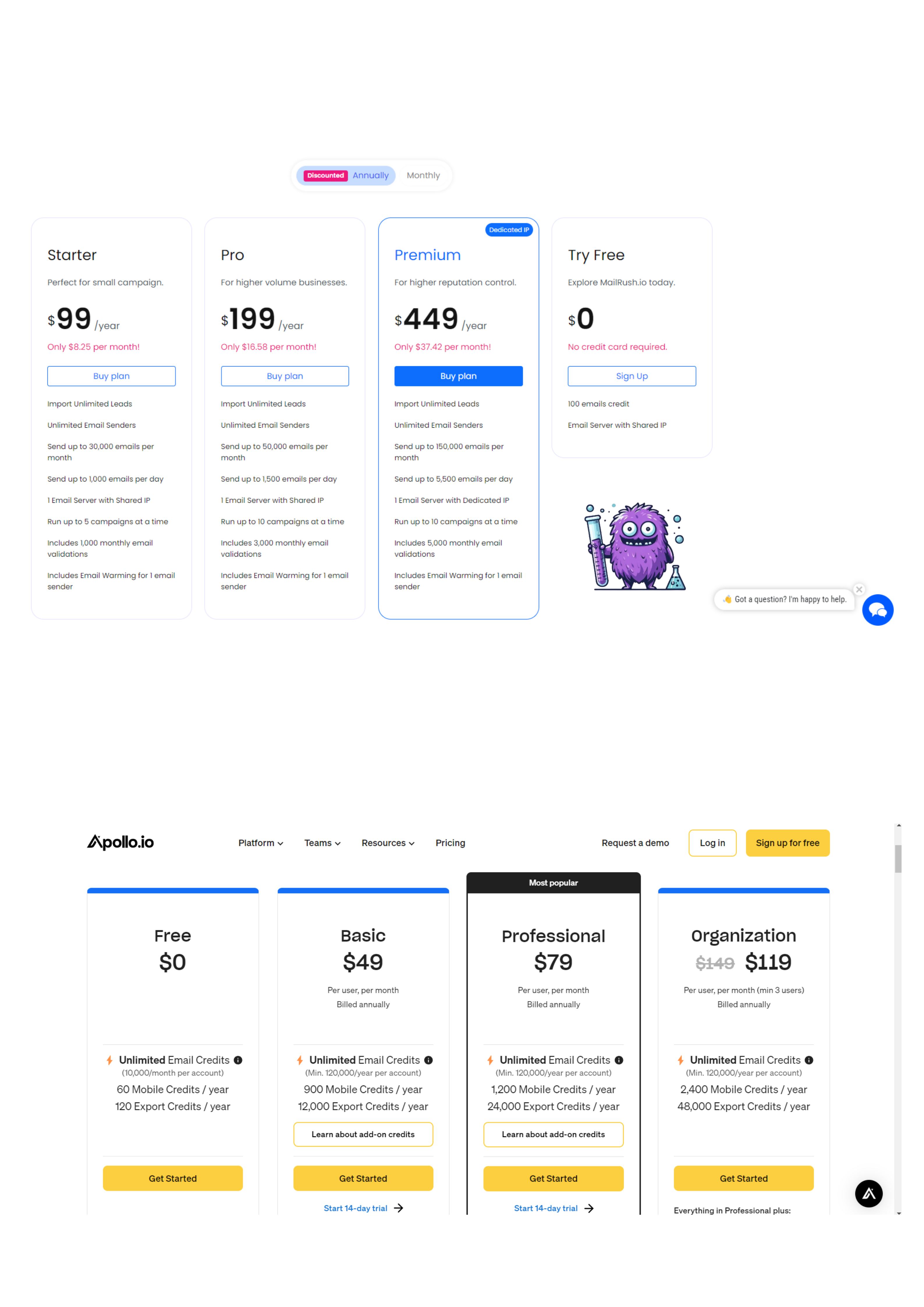
Display monthly prices for annual plans
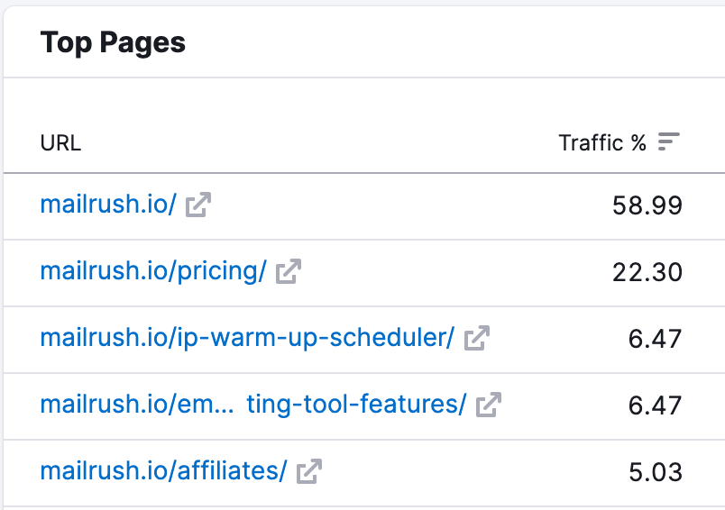
According to SEMRush, a quarter visitors to MailRush’s site visit the pricing page, which makes it important real estate.
The key issue I have here is the plans show annual prices instead of monthly prices.
When I first got to their pricing page, I thought they were charging $449 per month for their Premium plan. Turns out that was the annual price.
This is IMHO a MASSIVE unforced error.
Most platforms display prices on a monthly basis even for their annual plans so MailRush runs into the problem of an unfamiliar user interface.
Users are expecting to see a monthly price and a good chunk are likely going to think they’re getting a much better price with Apollo’s highest plan of $119/month.
To prove my point, here’s a comparison between MailRush’s and Apollo’s pricing pages. you’ll notice that Apollo displays monthly prices for their annual plans. Check any popular SaaS’s pricing page and you’ll get the same result.
ALWAYS. DISPLAY. MONTHLY. PRICES.
💡Experiment 4: Revenue
Spell out discounts more clearly
While we’re on the pricing page, I want to point out that MailRush actually offers MASSIVE discounts — as much as 57% for the Pro Plan!
The toggle between monthly and annual should spell out how much users stand to save (up to 57% off) and not just say “discounted.”

💡Experiment 5: Retention
Add a signup form before the checkout page
Selecting a plan takes you to a horrendous looking checkout page. More on this in the next section, but essentially, users are bombarded with information, and probably think that signing up is too much work.

In any given funnel, once we’ve driven people to our website (acquisition), we then want to get them to provide their contact information (activation) so we can then send them follow up emails (retention).
Apollo does a much better job of this:
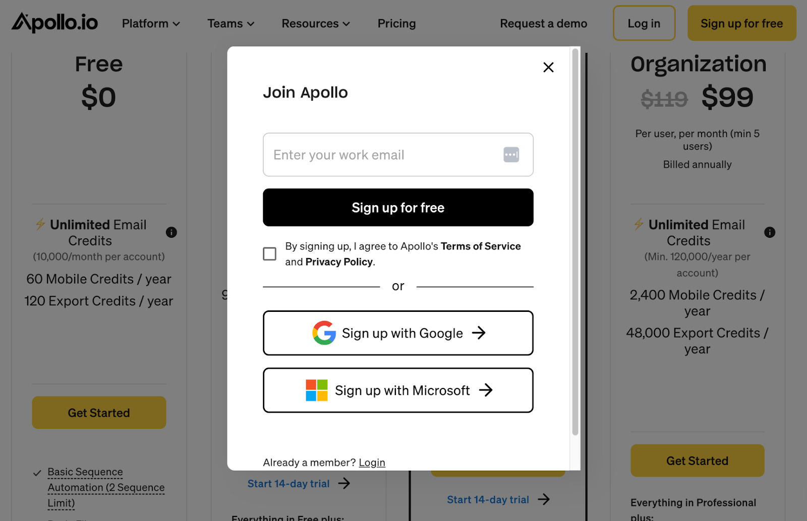
As you can see, their sign-up process involves just an email address or even a Google or Microsoft signup. Low commitment is what we want at this stage.
The reason it’s crucial to get users’ emails early on in the user journey is that 70% of checkouts are abandoned for one reason or another.
If we have users’ emails, we can send them abandonment recovery emails that remind them to complete their purchase.
💡Experiment 5: Revenue
Remove Checkout Page distractions
The checkout page is chock full of distractions and opportunities to navigate away from the purchase.
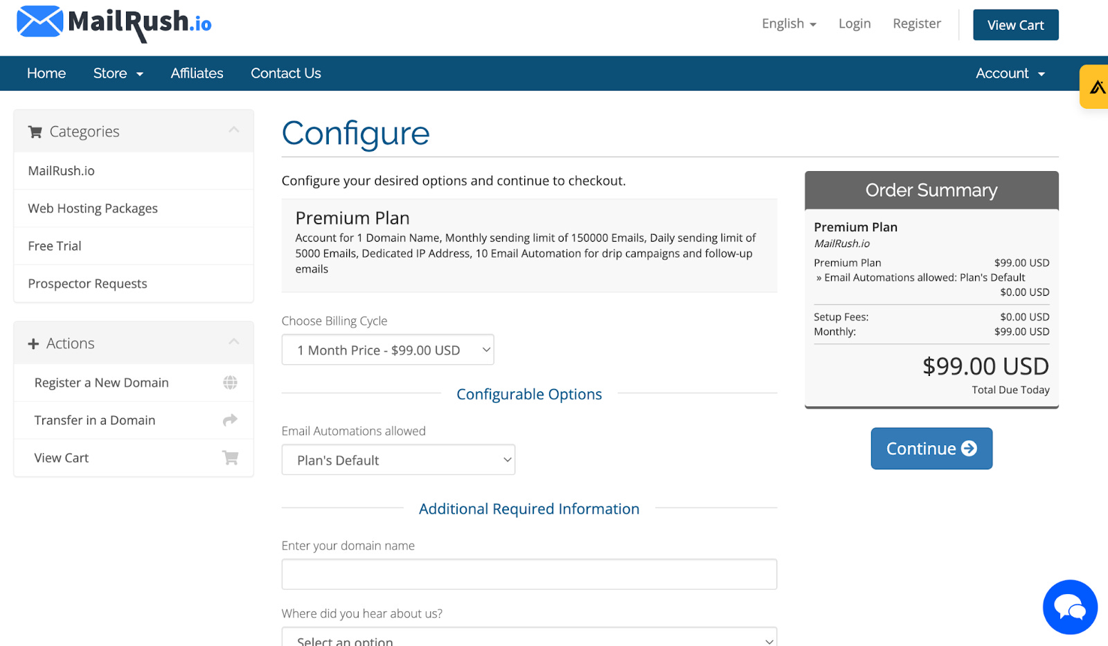
Don’t even know where to begin here except to just do away with all the other options. The user has selected the plan they want, all they want is a way to complete the purchase.
See how SEMRush does it: no distractions on the checkout page, just a credit card form.

TLDR
Retarget, retarget, retarget
Offer free email warmup as a lead magnet
Display monthly pricing for annual plans
Spell out monthly discounts on annual pricing page more clearly
Move signup before checkout page
Remove checkout page distractions
4 Things Before You Go
Tell me what you think. Please let me know if you liked what you read. Your feedback means the world to me, and I respond to every email.
Subscribe to the newsletter. If you haven’t already, please consider subscribing to our newsletter to get free AARRR audits delivered straight to your inbox every week.
Want an audit? Shoot me an email with your SaaS and I’ll add it to the waitlist.
Want to ‘unstuck’ your SaaS growth? Our consulting arm, launchexperiments.com, specialises in helping bootstrapped SaaS founders grow their businesses. Schedule a free call today.
Great write-up! Thanks for sharing.
Love the content! Going through an actual use case is great. Do business owners implement these suggestions? I would love to see what the results of making these changes are.